Friday, 20 December 2013
Wednesday, 18 December 2013


Thursday, 12 December 2013

Friday, 6 December 2013
DRAFT EVALUATION 4
How did you use media technologies in the construction and research, planning and evaluation stages?
PRE PRODUCTION
- YouTube- This was the program which I used to view other music videos which had already been made by other artists so I could analyse them and see conventions commonly used within the genre which I had chosen. they were free to watch and I could watch them as many times as I wanted to.
- Google- Google search mean I was able to search for anything in my research and planning. The most common, relevant results were shown first which meant it saved me time searching through pages meaning it made researching more efficient. Google images meant that I could find images of the artists who I was taking inspiration from as well as aspirational images which I used in my mood board and when thinking of possible mise en scene to use.
- Twitter- ###########
- Scanner- When coming up with ideas such as possible digipack ideas, poster ideas and artist names, I did this by hand on paper and then scanned them into the computer via a scanner. This allowed the hand drawn/written pages be scanned and then an image of the paper would be sent to my email which I could then crop and add instantly to the blog. The images were of a high quality meaning this was a better option than taking a photo and downloading it onto the computer.
- Animoto- I used this to make my pitch. I could add images, text and a song which would help to portray my vision to peers. This also allowed me to embed the animoto video onto my blog so peers could see it and leave their feedback which was a vital part of the course.
- Slideshare- I used this to add the work I did over the summer- Which included listing conventions and music video analysis- onto my blog in a neat and easy way. This site meant that I could embed a power point presentation online which could be viewed and was easy to navigate through.
- lookbook.nu- I used this in order to get images of inspiration for my artist which were incorporated within my mood baord. they are professional looking images and there were so many different styles which I could choose from to show how I wanted my artist top look. This site helped me to portray my vision even further.
- Microsoft programs- ##################
- final cut pro- I used this to make my animoto. After struggling on windows movie maker (fail) to make the animatic, this softwear meant I was able to edit my images together to the correct, planned timings so that I could see what my final video would look like.
PRODUCTION
- Macbook- Used to edit the video as it had the right softwear needed at anytime as opposed to just when we had media lessons. At school there are only a few Mac computers with the correct softwear so it would be difficult to have one available to use whenever I needed it so by having this made it easier and more efficient for editing the first draft and final video
- Final Cut Pro- The softwear on the macbook which enabled me to edit the length of shots and put it all together over the song in order to create my final video. After a struggle with windows movie maker, final cut was very easy to use and made the video I had made seem very professional as the transitions were a very smooth. I could also add other effects if I wanted to) for example the end fade or colour changes) in order to use convention of ready made music videos of that genre.
- Digital video camera- Used to film my artist. The footage would then be put onto the macbook and edited on final cut pro. The camera gave a high quality finish and meant that I could film my song in its entirety before editing.
- SD card- Stored all of the footage of from my filming meaning I could put it onto any computer to edit meaning that the process was fairly quick which then meant I could get editing the video faster in order to meet the deadlines.
- SD card reader- Meant the SD card could be read and the footage downloaded onto the computer in order to edit. this was a very efficient way of downloading the files and made the process very quick which meant that I could begin editing faster in order to meet deadlines.
- iTunes- Used to download the song and add to final cut pro on the video. This allowed the quality of the song to be high which added to the overall professional aspect of the video which I wanted to achieve.
- Photoshop- Used to edit the scanned images and add text/more images/effects etc within the digipack and poster. this meant that the overall digipack had a more professional looking edge as the softwear meant I could tweak most aspects of the digipack and poster until they looked just right.
- Scanner- Scanned in the images which I had hand drawn which I then edited on Photoshop. An image of the scanned paper would be sent to my email which I could then crop and add instantly to Photoshop. The images were of a high quality meaning this was a better option than taking a photo and downloading it onto the computer.
- YouTube- The online video viewer meant I could upload both my first draft and final video and put them on my blog quickly so they could be viewed and so I could gain feedback (first draft) of how to make it better (final video)
POST PRODUCTION
- TubeChop- used in evaluation question 1 for showing evidence when answering the question.
- Scribd.
- Glogster
- Prezi
- Photoshop
- Microsoft Word
ALL 3
- blogger
- iPhone
- computer
Thursday, 5 December 2013
DRAFT EVALUATION 3
What have you learned from your audience feedback?
BLOG FEEDBACK
I received feedback from my peers in class throughout the research and planning as well as making. This helped me realise what I needed to do in order to make my idea better or more specific.
MOOD BOARD

The reason for my mood board was to show the theme and style which I wanted to portray in my final video and digipack. The look I wanted was vintage which is why I have included the vintage items and clothing and I wanted it to be very busy which is why the overall mood board was very scattered and busy.
My teacher: MR FORD said that he liked the idea and that it encapsulated my vision very well. To me, this meant that he liked the idea and that I should run with it.
SUMMER MEDIA WORK

The comment told me that I needed to do a more full extended analysis of some music videos in order to broaden my knowledge in the concepts used. From this, I did some music video analysis which tool some time but really helped me to understand how certain concepts reflect the genre of music chosen in the video. This was particularly relevant in the Capital Cities- Safe and Sound video.
This also suggested that I looked at other students work for guidance, from this I have regularly looked at work done by other students to ensure that the quality of my work is up to the right standard. This has helped me to understand tasks better and to see how peers present their ideas.
ARTIST NAME

The comment says I should explain why I have chosen this name. This then lead me to think deeply about the name I should use in order for it to reflect the genre as well as the intended target audience. After this feedback, I then did a post explaining why I had chosen "Allie James" as the name for my artist.
ARTIST COMPARISON

My feedback from my teacher showed that the artist and styling which I was comparing my artist with was good to do comparisons with because they are of the same gender, genre and aim their products at a similar target audience which I plan to do. Therefore, it would be good for me to style my artist in similar ways to these artists (this is referred to in evaluation question 1).
FEEDBACK OF BLOG: MID POINT REVIEW

Although I had done some of the work required, my teacher had said that my blog was sparse and needed to include more posts regarding planning. This suggested that I:
- Added an artist biograhy: since I received this feedback, I have done a biography of my artust explaining a bit about where she is from, her parents, friends and how she got into the music business.
- Looked at some location ideas: I have done a post considering a few ideas on where to film my video alongside a brief explanation of why this would be good. I then came to the decision of using none of the locations I had originally decided to do, however this post was useful as it helped to rule out a few locations which I originally thought would be a good idea to use.
- Added audience research page: I did this using UK Tribes which gave me a greater knowledge of the type of people I would be aiming my products at. I found out what they liked, interests and hobbies which helped me when creating the products as I could make them more appealing to the intended target audience by including aspects which they would have found attractive.
- Create a playlist of songs which inspired my artist: I haven't done this and I probably should have done because they would have been of a similar genre. I could have watched the videos for the songs and got ideas for concepts to use in my video.
FLORENCE AND THE MACHINE VIDEOS

I had just added some of the videos by Florence and The Machine onto my blog to use as inspiration, however this feedback suggested that I analyse the music videos and suggest how I can inorporate sections of this into my own music video. I then edited the post and included comments on the use of; mise en scene, lighting, camera shots/angles and editing techniques and how these could be modified and included in my video.
MUSIC VIDEO ANALYSIS

This feedback said that my analytical skills when talking about the video were good, however they needed to be more reflective and include a comment on how I can take inspiration from the videos and use it in my video in order to make the analysis more worth while in terms of making a music video after doing the research.
SONG CHOICE

My teacher said that I needed to include information on why I have chosen this song and I have included a post with the reasoning for the song choice. These included things such as me knowing the target audience well as I would be counted as a member of the intended target audience.
LYRICS AND TIMINGS

The feedback on this post was to include more information on my filming regarding shots, speed of editing, etc as this would help me when creating my storyboard and then my final video, however I didnt do this as I didnt have an idea so didnt know what information to include.
In hindsight I should definitely have done this as it would have made story boarding a lot easier and I wouldn't have struggled as much to come up with a concept for my video.
PITCH

I received feedback from peers. The overall view was that they liked the idea of creating a vintage theme running throughout the video as well as the fact my idea of how I wanted it to be styled was very clear. However I was a bit vague in certain aspects of my pitch (one example being I didnt have a specific song at this point in the research which most other students did).
POSSIBLE MISE EN SCENE

The overall comment from the teacher was that my ideas for the mise en scene were good, however he wasn't sure of which items I would definitely be able to use. He suggested doing another post on the mise en scene I had available to me which I would be able to use in the video. I didn't do this before my first draft filming session and so when it came to it I found it difficult as I didn't know what props to use. This, however, changed before filming my second draft of my music video as I had created a post on what mise en scene I was going to use which made it a lot easier and less rushed/stressful on the day of filming.
FIRST DRAFT VIDEO

This feedback from my teacher showed what I had done well and had given his advice on what I needed to do in order to make it better and to achieve a higher grade. The image above shows the A4 document he wrote on describing how I needed to do things (aka re film the entire video) and how to do this to gain marks. I took this feedback onboard and printed the sheet out and took it to filming where I then did everything he suggested and ticked them off along the way. This ensured that I used everything I needed to in order to improve my video from 19/40 to a higher grade.
MORE??
In order to gain more feedback on my video from people who would be considered the "intended target audience", I am going to do a film screening to ten people in order to get their opinions regarding the video.
I have made a list of these people:

This is the list. All of these people are between the age of 15 and 25 which is the age I believe my target audience would be. It is important to see whether or not they like it because otherwise my research and planning would have lead me to believe the wrong things about their tastes and would have failed in entertaining and appealing to the audience. In order to get their opinions, I am going to make a questionnaire which I can hand to them to fill in.

I am also going to show the video to some males because I need to see if they don't like the video as I have anticipated throughout my research and planning. This will reinforce that my video is aimed at females and so therefore females will like it more than males do. The list of boys I am going to show the video to is shown above.
I have created a questionnaire for these people to fill in so I can gather data and see if my video appeals to the right target audience and why it appeals to them. I also need to do the same with my digipack and poster because all 3 products are promoting the same thing (my artist/sing/genre) and so all 3 need to be appealing to the same, correct target audience.

I have created a questionnaire for these people to fill in so I can gather data and see if my video appeals to the right target audience and why it appeals to them. I also need to do the same with my digipack and poster because all 3 products are promoting the same thing (my artist/sing/genre) and so all 3 need to be appealing to the same, correct target audience.

I have planned for all of the people to watch the video and look at the digipack and poster which I have made to see what they think of it and to gain honest feedback from the intended target audience.
I have created a questionnaire to give to the people watching my video in order to gain their feedback. This should give me information on whether or not my products appeal to the people I have aimed it at and also to see which elements of the video/digipack/poster they like the best. I have done mainly one word answers which is good as sometimes, when asking for feedback, people dont want to write really detailed answers and may not give their true opinion in order to save time when writing down the answers so by only asking for one word or very short answers, this ensures I will get their honest opinions. Also, by making sure I wasn't asking too many questions (it is a quarter of an A4 sheet of paper) I can be sure that the target audience answer all of the questions honestly.
Wednesday, 4 December 2013
DRAFT EVALUATION 2
How Effective is the Combination of Your Main Product and Ancillary Texts?

Final Poster

Final Digipack
Final Video
Combination of the video and poster
- Although I had planned for it, my artist ended up not wearing the dress which I had included in the image on the poster. This could have looked unprofessional and as though it wasn't part of the same product, however I think this works quite well and isn't that big of a deal.
- The vintage style is continued in the video (through the use of costume and mise en scene) as well as the poster (through the outfit in the image, background and font) which works well and makes all of the products look involved in each other. It was this type of continuity which I wanted to show throughout my products to make sure they all looked authentic.
- Also, the background on the poster links in well with one of the outfits which she is wearing as it has a similar colour scheme and pattern. This adds to the continuity within all three of my products.


- I also wanted to use an image on the poster that looked like my artist as I wanted to make sure it all related and went well together therefore the reflection of the artist in the poster ensures that the intended audience know the artist belongs with the product.
- Again, my artist wasn't wearing the blue dress which I had originally planned, however she was wearing a similar style/coloured outfit as the one she is wearing on the panel on the inside of the digipack.


- I also made sure that the image I used in the digipack looked like my artist in order to make sure they looked like they belonged to her. I wanted to make sure the digipack related to the singer as I have done research into album covers which don't relate to the artist and I didn't like them as much as the ones which did.
- I have also continued the mise en scene within both of these products. In the video I have filled the are with a lot of items to give it the vintage theme which I wanted. I have also included a vintage style bird cage on two of the panels in the digipack. Showing these vintage props continues the theme as well as the "cluttered" look which I was going for.


- Same image- I have us ed the same image on my poster as have on the cover of my digipack. I feek that this gives a more professional approach and will ensure that my target audience would know that the products were both adverytsing the same thing. For example, if they saw the poster advertising the CD, they would easily be able to recognise the album in a shop because it looks so alike.

- Same record label- Parlephone. I have done this as it creates a brand identity and is more of a marketing ploy. The record label is the label that will have paid for the album to be made and so therefore use their logo/branding on the cover and poster.
- Same font- this adds continuity and means that people would be able to recognise the CD when they see it in a shop after seeing the advertising poster because they use the same font. This creates a brand for my artist (which has been done for other artists including Oasis who were one of the best selling bands) and means her name/brand/logo will be instantly recognisable


- Same background- is effective to the target audience as it means that the products have continuity and are recognisable of being part of the same product range for the same artist. This also contiunes the vintage theme which I wanted to portray within my products links well with each other as well as collectively alongside the video.
- Same style- handmade. I chose to do a handmade sketch design on both my digipack and poster because I thought it represented the indie and folk influences of the song. After looking at various album covers from these genres, a hand made look was often used and so using this look on my products meant that they looked more authentic. This look also meant that the intended target audience would recognise these conventions as being part of those specific genres- the genres which they are interested in- which would spark an interest in the album/poster.
- Same colours- the same colour scheme makes both the digipack and poster look as though they are part of the same marketing ploy which is the main reasoning for the products. The vintage colours also means that both the products link in with the video. This relflects the style which I planned to use and the styles shown in the videos which I analysed that were aimed at a similar target audience as my video is.

Marketing Ploy
The products which I have created all form a marketing ploy which will be used in order to promote the song and the artist. The poster used advertises the CD which the target audience will (hopefully) want to buy, the CD digipack will then advertise the "new single" which would then push the target audience to go online and look at the video.
This kind of marketing ploy is something which music labels (such as Parlephone- the music label which my "artist" is signed to) would use as it would reach out to a wide audience. The video is a fairly cheap way of ensuring a lot of people the song and begin to hear about the artist which would spark an interest in the artist amongst the intended target audience. This interest would then continue to grow as they see the poster and digipack which would then lead to the artist gaining a bigger status within the music industry and then gaining a bigger following- this is achieved through social media sites such as Twitter (which my artist has), Instagram, Facebook and Tumblr. These social media sites are commonly used by my intended target audience and so would be easy for them to keep up to date with my artist and find out the latest news.
Tuesday, 3 December 2013
DRAFT EVALUATION 1
In what ways does your media product use, develop or challenge forms and conventions of real media products?
Saturday, 30 November 2013
MISE EN SCENE I USED
One thing which needed to be improved from my first draft was the volume of mise en scene I used in my location. I wanted to make it look very full and busy to please and entertain the intended target audience so to do this I needed to use a lot of props.

This is how the room looked after all of the mise en scene had been added which I believe to be a huge improvement from my original video. The first time around, it looked a bit empty and quite drab which wouldn't have necessarily grabbed the attention of the intended target audience and so it wouldn't have been a memorable video. By adding the amount of props which I have, I think the room looks a lot more interesting and fun as well as quirky and vintage which is something that would appeal to my intended target audience.
IMAGES OF MISE

In this section I have used: vintage books, vintage looking tins, candles, a lantern type candle, vintage style boxes, a fan, trinket boxes as well as hanging objects, jewelry, pillows and a vintage looking tape measure which looked really fitting with the rest of the mise en scene. I think that by positioning the objects to look intentionally messy and busy makes it look quirky- which a comment I got in my feedback from my first draft.

Here I have used: handbags, a vintage style owl shaped pillow (very cool), russian dolls, gift boxes, candles- including one in the shape of a VW camper van which looked very vintage yet trendy, a red trunk- which you cant really see) a vintage style chest of draws and a vintage style hanging dress trinket which was very fitting with the look I was going for and reflected the style of my artist well.

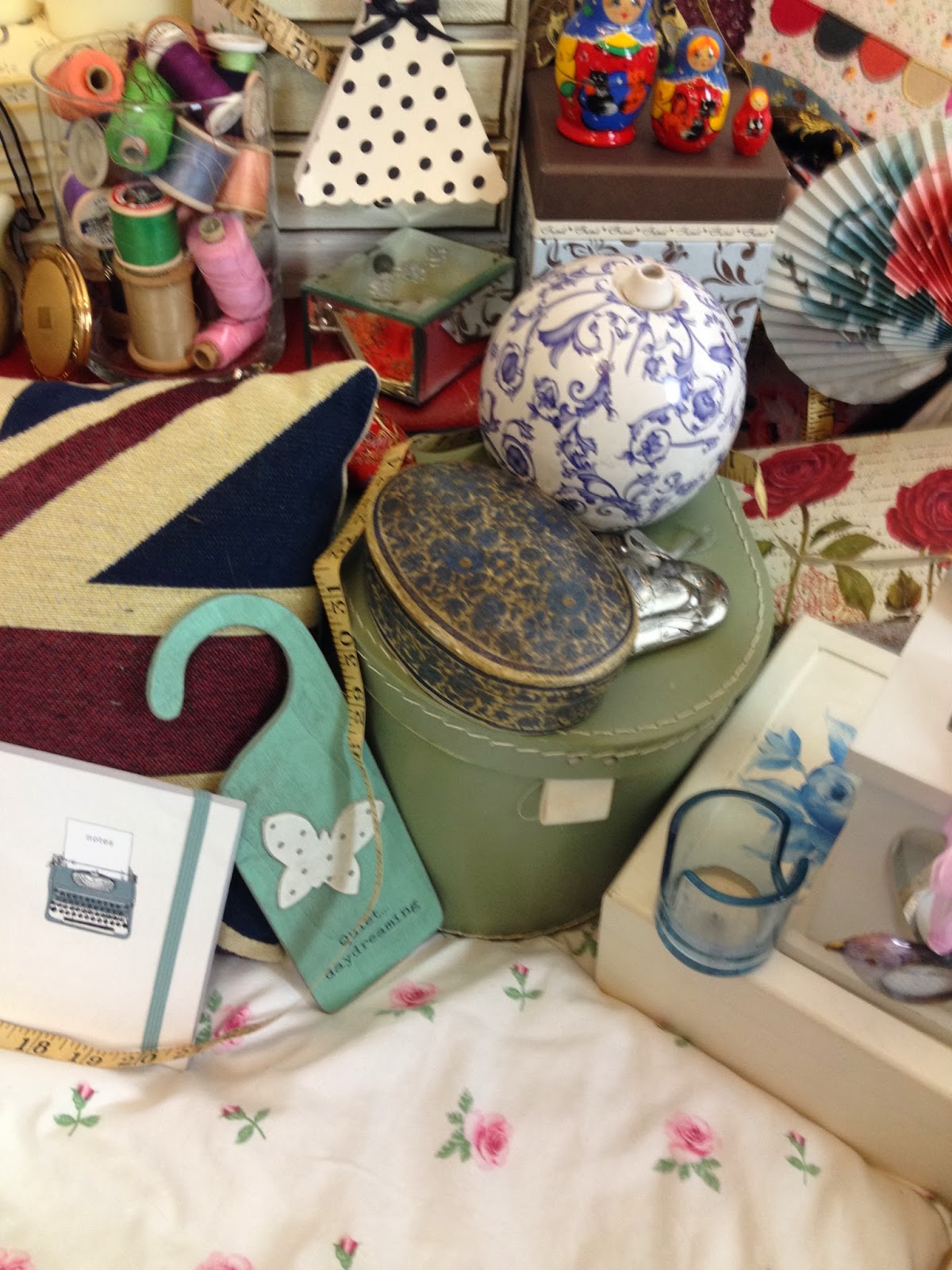
Here, you can see where I have filled a jar full of cotton reels in order to create a busy, colourful look (which I think works really well) , ornaments such as the cat, quirky shaped candles, hanging trinkets, vintage style boxes, a vintage style notepad, the flowery vintage bed cover and a union jack pillow.

These vintage style items add to the busyness of the room which I wanted to portray. To do this I have used the vintage style union jack pillow, a door stop which uses bright colours and a bold patter, a vintage, unique looking money box with some change in it to give authenticity, a lantern, a fluffy pillow and a vintage looking tin of pegs.


Here shows the side display unit where I have continued to give a busy, vintage look. On this table I have included a vintage, flowery make up trunk, a candle with a bright, vintage candle, a candle in a frosted glass look, a bucket, two watering cans, a vintage style handbag, a welly boot money box, nail varnishes, tins, a box with a vintage pattern, hanging trinkets, lots of jewelry which give the vintage style I am going for, a hand mirror and some fairly lights. All of these items make to room look quirky ad interesting which is how I wanted it to look. Also, on the bed I have included more candles, more trinket boxes, more jewelry, some flowers, some more hanging trinkets, a blue bag to appeal to the target audience and a vintage style clock to add to the overall vintage aesthetic.
Friday, 29 November 2013
FILMING REVIEW
27th November 2013
I have planned to film my final draft shots which needed to be re-filmed on this day.

Location
Previous feedback: The location could change or be styled to look quirkier. This would help to make the video look more interesting and more like your vision than it does in the first draft.
I have decided to use the same location as I think that, by adding more props and mise en scene, I can make room look busier yet still have a vintage edge. Also, after filming here last time I have a greater knowledge of the room and where abouts I will do the shots. Also, the artist is familiar with this location and doesn't feel uncomfortable. this is very important for me as she wasn't uncomfortable last time which made the video look more authentic and therefore more professional. I wouldn't want to jeopardise this by taking her somewhere else where she doesn't know as it could have an effect on the way she feels and the way she comes across.
**Looking back, I am pleased that I used this location as I think it looks home made (which was the look I wanted) and also has a vintage feel to it which, again, was something which I wanted to achieve. The mise en scene has helped a lot to make it look quirkier which was pushed by the feedback I received.
Artist
Previous feedback: She is good and fits the genre
I am using the same artist who I used in my first draft as I think she was convincing as a new, upcoming singer. As well as this, I think she was quite upbeat which reflected the genre well and would therefore be convincing and authentic when watching the video. I think she would attract and relate to the intended target audience as they would be the same age and are of a similar age.
**Looking back I am pleased that I used Chloe in the video as I think that she fits in with the brief of what the target market would be attracted to. Also, she is quite pretty and looks like she has star quality which is necessary within my video as it makes the target audience more intrigued by the artist and could lead to them researching her (via twitter, etc) and going on to buy her album. Also, Chloe has quite a vintage, natural look and so she fit in well with my vision.
Outfits
Previous feedback: Good however made to look boring by the bad, slow editing. Film X amounts of shots in three different outfits.
I have used more outfits. I liked the way she looked in the green/purple dress as this made her look a lot younger which would appeal to the intended target audience and so I decided to keep this as one of the outfits. After the first draft, I thought that the blue dress she was wearing blended into the background a bit and didn't make my artist look as striking as she is/should be in her own music video. Looking at Florence in her videos, she looks very striking and special which makes her stand out and I wanted Chloe to have a similar effect on the audience. Instead of this dress, I thought she could wear a dungaree play-suit which had a vintage twist and added a third outfit of some denim shorts and a flowery t-shirt which looked quite vintage and therefore fits the look I want.
**Looking back, the outfits were one of the most successful things about this video shoot. They fit the bill perfectly and looked very vintage however very young which would then be appealing to the intended target audience. The outfits suited the style I was going for as well as reflecting the vintage element of the genre.
Mise En Scene
Previous feedback: There needs to be a lot more because the room looked quite dull which make the whole video quite uninteresting for the audience to watch.

I have gathered a lot of props which took a while to position correctly, however I think that these made the shots look really interesting and quirky. This is the look I wanted to go for after taking inspiration from the Florence and The Machine videos which I looked at.
**Overall, the idea of making a list of things made it so much easier to organise which then created the interesting, quirky visual in the shots which made the video more entertaining for the intended target audience to watch. In an ideal world, I would have had a building which had old, vintage rooms which I could have styled to get a similar style of the Florence and The Machine, however I didn't have the budget for this so had to use the next best thing which was this room.
Shots done:
Note: I have done all of these shots (a, b, c) in three different outfits making 9 shots in total, however I had to do a few of them more than once. This took a lot longer than expected- please see filming diary.
a- Close up of the artist with the lights close to her face. This makes it look more professional and would therefore make the video have a better, more authentic quality.
b- Mid shot with the artist following the camera. Although this was tricky, in the end I got some shots which I think I will be able to use. I want my video to jhve a home made yet professional look to it and so I think that these will add to that look.
c- Long shot of the artist. this will be sitting on the bed and, although the original feedback said that these longer shots were boring, I have done them in slightly different positions and angles and so therefore- alongside some better, sharper editing- my video wont be boring.
Thursday, 28 November 2013
CREATING THE FINAL VIDEO

I am going to edit my footage from filming on a laptop using Final Cut Pro
I am going to do this to put all of my footage together and cut it down to make it all flow together over the song to make it look as professional.
Wednesday, 27 November 2013
FILMING DIARY
3:10- Get all of the equipment from school which I have pre-booked in advance. This means that the camera is fully charged, the tripod and dolly (spinny tripod wheels) are all there and the lights are available to be picked up.
Note: All of these pieces of equipment are quite large and would be a pain to get on the bus (lack of space, breaking, etc) so I have organised with my friend who has a car to tae me and the things home.
3:30- Get to my house to collect mise en scene which I have made a list of. This organisation helped to reduce the amount of time searching for props which I was going to use meaning I had more time for filming.
3:40- After loading all of the items (there is lots) into the car, get dropped off at the location. Unload and position all of the items in the location to look busy. There are also a lot of items in the locatipn that would go well with the vintage theme which I collect and add into the shots.
Note: This includes setting up the lights which was difficult as I wasn't too sure how to work them properly. This took a while as there was a lot of faffing about and giggling when they almost fell over.
4:00- Quickly do some test shots to see how the lighting and mise en scene looks together in the shot. Any amendments are made to improve the overall aesthetic of the shot.
4:10- Artists outfits are decided:
-1: Flowery pink/beige shirt and denim shorts
-2: Flower/butterfly purple/pink dungaree playsuit
-3: Green/purple vintage flowery dress
She gets changed, titivates her hair and adds more make up to look more professional and made up before she is gorgeous and camera ready.
4:20- Filming in the first of three outfits begins. We are flummoxed as neither of us can remember the words perfectly- the filming time for this outfit will take a lot longer than expected.
Note: By the end of the previous first draft filming session, we knew the words and could sing the song, including pitch changes, backwards hence our surprise when neither of us can remember the words very well.
4:25- After listening to the song and reading the lyrics a few times, filming is back on. Again, its not perfect however there isn't much more either of us can do. After 10 minutes (4:35) we have managed to do a long shot all the way through. I tick 'outfit 1 mid shot' off on my list with a smile.
4:35- We do a close up in outfit 1. This requires a change in the position of the lights so that they are right up by her face ensuring the professional edge to my video which I needed to show after the disastrous lighting in draft 1. This is then ticked off on the list.
4:45- From my teachers feedback, the third shot which I need to do is a "mid shot with her following the camera". Unsure of how to do this in a fairly small area- with the artist being taller than me- I rearrange the lighting and the mise en scene to how it should perhaps maybe possibly look.
Take 1: Is horrific. She feels awkward, it looks awkward, I'm laughing and at one point in the shot, I can see the light and a reflection of myself filming her in the mirror. We don't make it halfway through the song before we are both laughing.
Take 2: Again, is poor however slightly better than the first one. She still looks very awkward dancing around so I make the decision to just film her on the bed and I can zoom in and out and have her following the camera (this sounds like how an adult movie would probably be planned, however I am desperate for it not to look like the beginning of a home made porn film).
Take 3: Less awkward, we get through the whole song. It may look slightly kinky (she has a naturally kinky face as I found when filming this shot) however I will deal with that during editing. Ticked off on the sheet and move on.
5:00- Artist changes into outfit 2. Being a third of the way through is strange. It has taken longer than expected to be here, however marking things off on the sheet feels like there is a progress being made. More titivating of the hair and more make up added then filming again.
5:10- We complete the long shot- from a slightly different angle from the last shot as this would show a difference in camera angles!!!!- fairly quickly. Tick. The words are coming back slowly, however not all of them are right.
Note: "There's no shame in us playing best of that sega mega drive" is turning out to be very difficult. Baring this in mind, I try to think of a way of making sure I have footage to use for this area of the song. This proves very difficult as I say it over and over again to her before pressing the film button on the camera and she completely forgets. Again. And again. And again.
5:20- After a quick re-position of the light and camera, the close up in outfit number 2 is complete in one shot. Tick. By this point I have given up with the sega mega drive part of the song as it is becoming more hassle that it is worth.
5:25- The struggle with the "mid shot: artist follows the camera" shot continues, however this time it only takes 3 go's before this is done. Tick off on the list. Two thirds of the way through filming now!
Note: I have positioned the lights and myself a lot better, proving that practice makes ever so slightly better for the next time around.
5:35- Outfit change into the dress. Whilst she gets changed, adds more make up and does a bit more hair titivation, I watch back some of the shots and realise that the parts where she cant remember the words are awful. I decide that, during the close up shot section in this outfit, I am going to make sure she gets it right, no matter how many shots it takes.
5:40- The long shot is done from a slightly different angle with the lighting positioned to make her look more professional. This is done in one take and so we move on to the close up.
5:45- I re-position the lights which doesn't take as long as it did in the beginning as I have done this so often I am now a professional. The close up shot goes well except the lyrics which have been an issue throughout the whole shoot.
Note: In order to correct the lyric mistakes which have been a consistent mess; I say the lyrics to Chloe, she says them back and quickly (before she has forgotten them...again) play the song and film her. This should mean that she knew the words perfectly due to her having such a short period of time to forget them, however this was not the case. On the fifth take of each line she couldn't remember, we finally got to the stage where the was not brilliant, but acceptable to use.
5:55- After the awkwardness and struggles of filming the "mid shot : artist follows the camera" shot, I decided to not repeat this shot in outfit number 3, however decided to use an over the shoulder mirror shot which I used in the first draft which I thought worked really well. This would add more shots and would increase the variety of shots which I used throughout the video.
Note: It took a long time to get this shot right because I had to re-position all of the mise en scene to create the look which I wanted.
6:10- Finished shooting! Clearing up and reloading the props and equipment back into the car.
6:30- Night finished. Whoo.
PLANNING OF FILMING
Who: I am going to be filming my artist for the final version of my video to make the ammendments necessary in order to boost my grade and make it better for the audience to watch. My artist has stayed the same since the first draft and therefore she will know what to do and also will know the words (which was a minor issue last time we shot).
What: Re-filming the video to get a better, more professional look throughtout. The professional aspect needs to be noticable as a step up from my first draft as the poor lighting and poor mise en scene made the video look very drab.
When: 27th November in the evening. Although filming time is quite late, it as given me the change to think everything through and gather more props to dress the room in a more quirk way as that was an issue last time because the room looked really boring and not how i wanted it to look
Where: Same location, however more things everywhere to make it look more fun and interesting. Whoo!
Tuesday, 26 November 2013
FIRST DRAFT VIDEO: IMPROVEMENTS
Looking back on my first draft of the video, I can see improvements need to be made in order to make it look more professional. I have made a list of things which need to be improved so I can follow them when creating my final version to ensure that it is better than the original video:
- LIGHTING:
- The lighting in my video is poor which makes the video look quite unprofessional. Although the look I am going for within my video is homemade and vintage (which would suggest a lower quality 'look'), the lighting needs to be better to improve the overall look. Also, if the lighting looked better (and was a lot closer to her face) my artist would look better and would look more professionally made up. This, again, would imporve the overall look and professional element of my video.
- How am I going to do this? I am going to borrow some professional lights from school and position them to suit the shot. This would make the shots look better and the video overall more professional.
- MISE EN SCENE
- Although I used some props, the overall look which I wanted to achieve (busy, clustered) didn't happen. this was because I didn't have enough items within the shots for it to look as busy as I wanted it to.
- How am I going to do this? I am going to create a list of possible items which I can use in the video which I will add to the other props to look interesting and quirky. This should help to achieve the busy, full look which I want to show with a vintage twist. All of the items I am going to use will have a vintage look to ensure they are quirky and goes well with the vintage theme I have strived for throughout my research, poster and digipack.
- VARIETY OF SHOTS
- The amount of shots I used weren't enough to make the video look authentic. Most videos use a lot of shot cuts or have something happening in the longer shots- this wasn't the case in my video as my artist was either standing or sitting and singing. Therefore I need to edit more shots into the video with a shorter length to include more shots overall.
As well as these, I am including the advice which I have taken from my teacher feedback.
Although there are other things which I will need to change, these are the 3 main things which I need to improve on in order to make the video more interesting and more professional overall.
Monday, 25 November 2013
FIRST DRAFT VIDEO: FEEDBACK
This is the feedback I have received from my teacher regarding my first draft video.

I need to take into considerations the "tips" my teacher has given me as this will ensure that the video I make and edit for the final draft will be better and would get me a better grade. This would also improve the look and feel of the video.
To make sure I include all of his advice and my own personal opinions of how to make it better, I am going to make an improvements list which should help me when filming as I will be more organised and can follow the list.
Sunday, 24 November 2013
Saturday, 23 November 2013
EDITING
FINAL CUT PRO

This shows me using final cut pro on a macbook pro. The software helped me to edit the footage together over the song so that I could create the video and ensure the lip syncing was timed correctly making the overall video look professional.
Friday, 22 November 2013
FIRST DRAFT FILMING REVIEW
Creating the first draft of my music video went as I expected it to go. I wasn't as organised as I should have been in some areas, for example- Chloe (my singer) didn't know the chosen song until a few days before filming and so she struggled to learn the words. There were few ways to get around this so I ended up printing the lyrics and hanging them from a clothing hanger on the camera tripod so she could read them during filming. Although this wasn't ideal, it worked.

Also, the location managed to look quite cozy and quite vintage, however I need to use more items in order to make the room look busier. I wanted to include interesting objects to form a full, quirky looking room. Objects such as the ones which are used in the Florence and The Machine videos.

All of the items which I used in the video were vintage inspired in order to give the effect which I wanted, as I felt that it reflected the song and the look of my artist. Therefore I used mise en scene such as fairy lights, boxes, a guitar, pillows and mirrors as well as Chloes outfits.
The element of my first draft which I feel like I got right was the outfits. The dresses were both very vintage which fit in well with the theme which I want to portray. Her hair and make up was all very natural and looked authentic which I thought was good and looked vintage-esque and reflected the genre.

One thing which went horrifically wrong was the lighting which I used. I didn't have proper lighting so I had to use a lamp (which wasn't very bright at all) in order to light all of the shots. This made the video and the shots look quite unprofessional and so for the final video I need to improve the lighting and overall look of the shots.
HOW IT WENT
- Overall, it went okay considering I wasn't very organised at all. This was a huge concern and I panicked a lot in the days running up to it- especially when I realised that Chloe didn't know the song or the lyrics and we were filming the next day.
- Lighting could have been improved, however this is something to change and make better in the transition from my first draft to my final draft. I will need to borrow some lights from school which can loght the room to a professional standard as one low level lamp isn't good enough.
- It did look quite vintage which was the aim, however there weren't enough things in order to create the busy look I wanted. However now I know this, I can plan and arrange more props for the re-shoot of the video.
Subscribe to:
Posts (Atom)