Saturday 30 November 2013

MISE EN SCENE I USED

One thing which needed to be improved from my first draft was the volume of mise en scene I used in my location. I wanted to make it look very full and busy to please and entertain the intended target audience so to do this I needed to use a lot of props.


This is how the room looked after all of the mise en scene had been added which I believe to be a huge improvement from my original video. The first time around, it looked a bit empty and quite drab which wouldn't have necessarily grabbed the attention of the intended target audience and so it wouldn't have been a memorable video. By adding the amount of props which I have, I think the room looks a lot more interesting and fun as well as quirky and vintage which is something that would appeal to my intended target audience. 

IMAGES OF MISE


In this section I have used: vintage books, vintage looking tins, candles, a lantern type candle, vintage style boxes, a fan, trinket boxes as well as hanging objects, jewelry, pillows and a vintage looking tape measure which looked really fitting with the rest of the mise en scene. I think that by positioning the objects to look intentionally messy and busy makes it look quirky- which a comment I got in my feedback from my first draft. 


Here I have used: handbags, a vintage style owl shaped pillow (very cool), russian dolls, gift boxes, candles- including one in the shape of a VW camper van which looked very vintage yet trendy, a red trunk- which you cant really see) a vintage style chest of draws and a vintage style hanging dress trinket which was very fitting with the look I was going for and reflected the style of my artist well.


Here, you can see where I have filled a jar full of cotton reels in order to create a busy, colourful look (which I think works really well) , ornaments such as the cat, quirky shaped candles, hanging trinkets, vintage style boxes, a vintage style notepad, the flowery vintage bed cover and a union jack pillow.


These vintage style items add to the busyness of the room which I wanted to portray. To do this I have used the vintage style union jack pillow, a door stop which uses bright colours and a bold patter, a vintage, unique looking money box with some change in it to give authenticity, a lantern, a fluffy pillow and a vintage looking tin of pegs.


Here shows the side display unit where I have continued to give a busy, vintage look. On this table I have included a vintage, flowery make up trunk, a candle with a bright, vintage candle, a candle in a frosted glass look, a bucket, two watering cans, a vintage style handbag, a welly boot money box, nail varnishes, tins, a box with a vintage pattern, hanging trinkets, lots of jewelry which give the vintage style I am going for, a hand mirror and some fairly lights. All of these items make to room look quirky ad interesting which is how I wanted it to look. Also, on the bed I have included more candles, more trinket boxes, more jewelry, some flowers, some more hanging trinkets, a blue bag to appeal to the target audience and a vintage style clock to add to the overall vintage aesthetic. 

Friday 29 November 2013

FINAL VIDEO

FILMING REVIEW

27th November 2013
I have planned to film my final draft shots which needed to be re-filmed on this day.


Location

Previous feedback: The location could change or be styled to look quirkier. This would help to make the video look more interesting and more like your vision than it does in the first draft.

I have decided to use the same location as I think that, by adding more props and mise en scene, I can make room look busier yet still have a vintage edge. Also, after filming here last time I have a greater knowledge of the room and where abouts I will do the shots. Also, the artist is familiar with this location and doesn't feel uncomfortable. this is very important for me as she wasn't uncomfortable last time which made the video look more authentic and therefore more professional. I wouldn't want to jeopardise this by taking her somewhere else where she doesn't know as it could have an effect on the way she feels and the way she comes across.
**Looking back, I am pleased that I used this location as I think it looks home made (which was the look I wanted) and also has a vintage feel to it which, again, was something which I wanted to achieve. The mise en scene has helped a lot to make it look quirkier which was pushed by the feedback I received. 


Artist

Previous feedback: She is good and fits the genre

I am using the same artist who I used in my first draft as I think she was convincing as a new, upcoming singer. As well as this, I think she was quite upbeat which reflected the genre well and would therefore be convincing and authentic when watching the video. I think she would attract and relate to the intended target audience as they would be the same age and are of a similar age.
**Looking back I am pleased that I used Chloe in the video as I think that she fits in with the brief of what the target market would be attracted to. Also, she is quite pretty and looks like she has star quality which is necessary within my video as it makes the target audience more intrigued by the artist and could lead to them researching her (via twitter, etc) and going on to buy her album. Also, Chloe has quite a vintage, natural look and so she fit in well with my vision.


Outfits

Previous feedback: Good however made to look boring by the bad, slow editing. Film X amounts of shots in three different outfits.

I have used more outfits. I liked the way she looked in the green/purple dress as this made her look a lot younger which would appeal to the intended target audience and so I decided to keep this as one of the outfits. After the first draft, I thought that the blue dress she was wearing blended into the background a bit and didn't make my artist look as striking as she is/should be in her own music video. Looking at Florence in her videos, she looks very striking and special which makes her stand out and I wanted Chloe to have a similar effect on the audience. Instead of this dress, I thought she could wear a dungaree play-suit which had a vintage twist and added a third outfit of some denim shorts and a flowery t-shirt which looked quite vintage and therefore fits the look I want.
**Looking back, the outfits were one of the most successful things about this video shoot. They fit the bill perfectly and looked very vintage however very young which would then be appealing to the intended target audience. The outfits suited the style I was going for as well as reflecting the vintage element of the genre.


Mise En Scene

Previous feedback: There needs to be a lot more because the room looked quite dull which make the whole video quite uninteresting for the audience to watch.


I have gathered a lot of props which took a while to position correctly, however I think that these made the shots look really interesting and quirky. This is the look I wanted to go for after taking inspiration from the Florence and The Machine videos which I looked at.
**Overall, the idea of making a list of things made it so much easier to organise which then created the interesting, quirky visual in the shots which made the video more entertaining for the intended target audience to watch. In an ideal world, I would have had a building which had old, vintage rooms which I could have styled to get a similar style of the Florence and The Machine, however I didn't have the budget for this so had to use the next best thing which was this room.


Shots done: 

Note: I have done all of these shots (a, b, c) in three different outfits making 9 shots in total, however I had to do a few of them more than once. This took a lot longer than expected- please see filming diary.

a- Close up of the artist with the lights close to her face. This makes it look more professional and would therefore make the video have a better, more authentic quality.

b- Mid shot with the artist following the camera. Although this was tricky, in the end I got some shots which I think I will be able to use. I want my video to jhve a home made yet professional look to it and so I think that these will add to that look.

c- Long shot of the artist. this will be sitting on the bed and, although the original feedback said that these longer shots were boring, I have done them in slightly different positions and angles and so therefore- alongside some better, sharper editing- my video wont be boring.

Thursday 28 November 2013

CREATING THE FINAL VIDEO


I am going to edit my footage from filming on a laptop using Final Cut Pro

I am going to do this to put all of my footage together and cut it down to make it all flow together over the song to make it look as professional. 

Wednesday 27 November 2013

FILMING DIARY

3:10- Get all of the equipment from school which I have pre-booked in advance. This means that the camera is fully charged, the tripod and dolly (spinny tripod wheels) are all there and the lights are available to be picked up. 

Note: All of these pieces of equipment are quite large and would be a pain to get on the bus (lack of space, breaking, etc) so I have organised with my friend who has a car to tae me and the things home

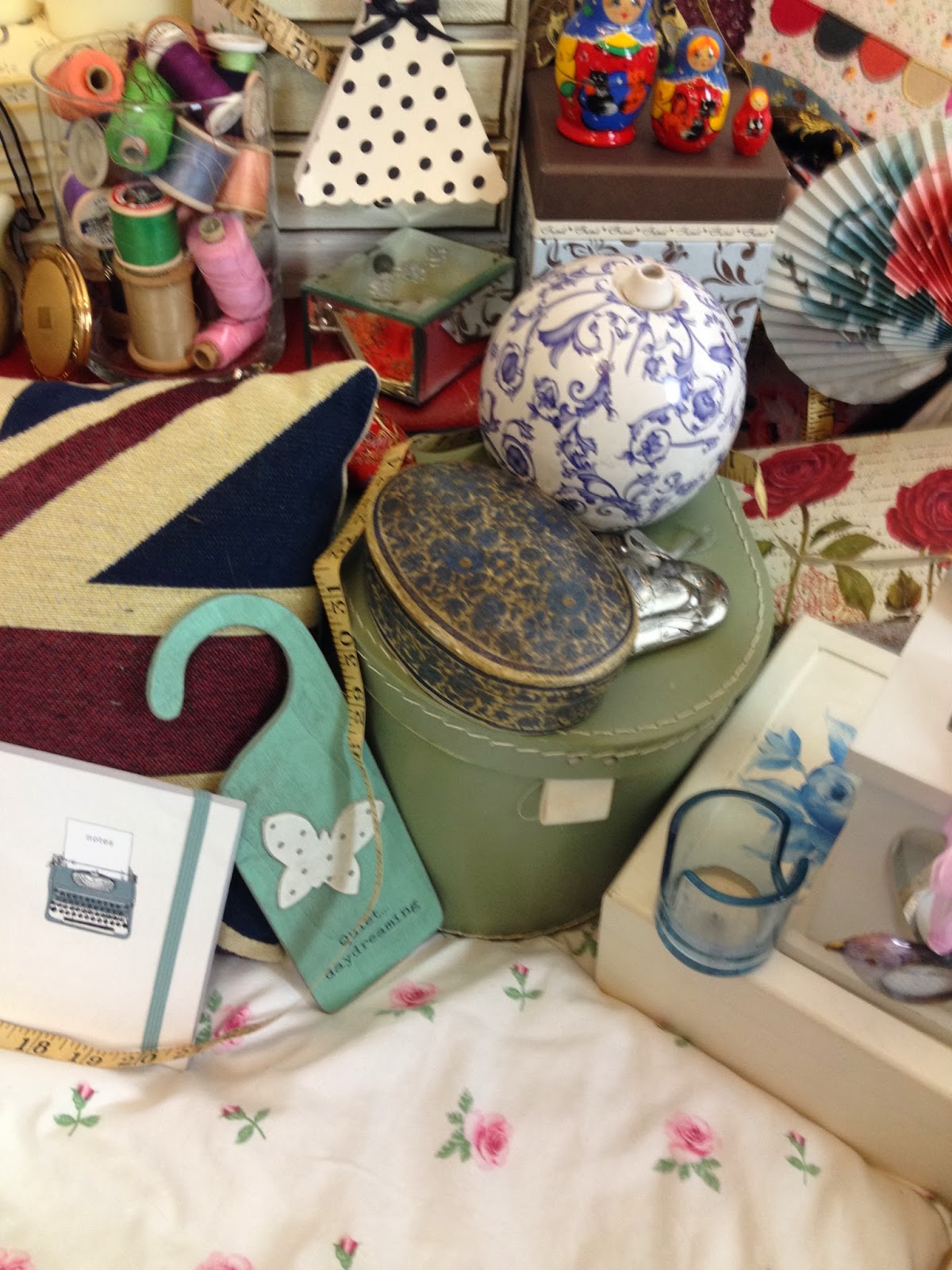
3:30- Get to my house to collect mise en scene which I have made a list of. This organisation helped to reduce the amount of time searching for props which I was going to use meaning I had more time for filming.

3:40- After loading all of the items (there is lots) into the car, get dropped off at the location. Unload and position all of the items in the location to look busy. There are also a lot of items in the locatipn that would go well with the vintage theme which I collect and add into the shots.

Note: This includes setting up the lights which was difficult as I wasn't too sure how to work them properly. This took a while as there was a lot of faffing about and giggling when they almost fell over. 

4:00- Quickly do some test shots to see how the lighting and mise en scene looks together in the shot. Any amendments are made to improve the overall aesthetic of the shot.

4:10- Artists outfits are decided:
         -1:   Flowery pink/beige shirt and denim shorts
         -2:   Flower/butterfly purple/pink dungaree playsuit
         -3:   Green/purple vintage flowery dress
She gets changed, titivates her hair and adds more make up to look more professional and made up before she is gorgeous and camera ready.

4:20- Filming in the first of three outfits begins. We are flummoxed as neither of us can remember the words perfectly- the filming time for this outfit will take a lot longer than expected.

Note: By the end of the previous first draft filming session, we knew the words and could sing the song, including pitch changes, backwards hence our surprise when neither of us can remember the words very well.

4:25- After listening to the song and reading the lyrics a few times, filming is back on. Again, its not perfect however there isn't much more either of us can do. After 10 minutes (4:35) we have managed to do a long shot all the way through. I tick 'outfit 1 mid shot' off on my list with a smile. 

4:35- We do a close up in outfit 1. This requires a change in the position of the lights so that they are right up by her face ensuring the professional edge to my video which I needed to show after the disastrous lighting in draft 1. This is then ticked off on the list.

4:45- From my teachers feedback, the third shot which I need to do is a "mid shot with her following the camera". Unsure of how to do this in a fairly small area- with the artist being taller than me- I rearrange the lighting and the mise en scene to how it should perhaps maybe possibly look. 
     Take 1: Is horrific. She feels awkward, it looks awkward, I'm laughing and at one point in the shot, I can see the light and a reflection of myself filming her in the mirror. We don't make it halfway through the song before we are both laughing. 
     Take 2: Again, is poor however slightly better than the first one. She still looks very awkward dancing around so I make the decision to just film her on the bed and I can zoom in and out and have her following the camera (this sounds like how an adult movie would probably be planned, however I am desperate for it not to look like the beginning of a home made porn film).
     Take 3: Less awkward, we get through the whole song. It may look slightly kinky (she has a naturally kinky face as I found when filming this shot) however I will deal with that during editing. Ticked off on the sheet and move on.

5:00- Artist changes into outfit 2. Being a third of the way through is strange. It has taken longer than expected to be here, however marking things off on the sheet feels like there is a progress being made. More titivating of the hair and more make up added then filming again. 

5:10- We complete the long shot- from a slightly different angle from the last shot as this would show a difference in camera angles!!!!- fairly quickly. Tick. The words are coming back slowly, however not all of them are right. 

Note: "There's no shame in us playing best of that sega mega drive" is turning out to be very difficult. Baring this in mind, I try to think of a way of making sure I have footage to use for this area of the song. This proves very difficult as I say it over and over again to her before pressing the film button on the camera and she completely forgets. Again. And again. And again. 

5:20- After a quick re-position of the light and camera, the close up in outfit number 2 is complete in one shot. Tick. By this point I have given up with the sega mega drive part of the song as it is becoming more hassle that it is worth. 

5:25- The struggle with the "mid shot: artist follows the camera" shot continues, however this time it only takes 3 go's before this is done. Tick off on the list. Two thirds of the way through filming now!

Note: I have positioned the lights and myself a lot better, proving that practice makes ever so slightly better for the next time around. 

5:35- Outfit change into the dress. Whilst she gets changed, adds more make up and does a bit more hair titivation, I watch back some of the shots and realise that the parts where she cant remember the words are awful. I decide that, during the close up shot section in this outfit, I am going to make sure she gets it right, no matter how many shots it takes.

5:40- The long shot is done from a slightly different angle with the lighting positioned to make her look more professional. This is done in one take and so we move on to the close up.

5:45- I re-position the lights which doesn't take as long as it did in the beginning as I have done this so often I am now a professional. The close up shot goes well except the lyrics which have been an issue throughout the whole shoot.

Note: In order to correct the lyric mistakes which have been a consistent mess; I say the lyrics to Chloe, she says them back and quickly (before she has forgotten them...again) play the song and film her. This should mean that she knew the words perfectly due to her having such a short period of time to forget them, however this was not the case. On the fifth take of each line she couldn't remember, we finally got to the stage where the was not brilliant, but acceptable to use.

5:55- After the awkwardness and struggles of filming the "mid shot : artist follows the camera" shot, I decided to not repeat this shot in outfit number 3, however decided to use an over the shoulder mirror shot which I used in the first draft which I thought worked really well. This would add more shots and would increase the variety of shots which I used throughout the video.

Note: It took a long time to get this shot right because I had to re-position all of the mise en scene to create the look which I wanted.

6:10- Finished shooting! Clearing up and reloading the props and equipment back into the car.

6:30- Night finished. Whoo.


PLANNING OF FILMING

Who: I am going to be filming my artist for the final version of my video to make the ammendments necessary in order to boost my grade and make it better for the audience to watch. My artist has stayed the same since the first draft and therefore she will know what to do and also will know the words (which was a minor issue last time we shot).
What: Re-filming the video to get a better, more professional look throughtout. The professional aspect needs to be noticable as a step up from my first draft as the poor lighting and poor mise en scene made the video look very drab.
When: 27th November in the evening. Although filming time is quite late, it as given me the change to think everything through and gather more props to dress the room in a more quirk way as that was an issue last time because the room looked really boring and not how i wanted it to look
Where: Same location, however more things everywhere to make it look more fun and interesting. Whoo!

Tuesday 26 November 2013

FIRST DRAFT VIDEO: IMPROVEMENTS

Looking back on my first draft of the video, I can see improvements need to be made in order to make it look more professional. I have made a list of things which need to be improved so I can follow them when creating my final version to ensure that it is better than the original video:

  • LIGHTING: 
    • The lighting in my video is poor which makes the video look quite unprofessional. Although the look I am going for within my video is homemade and vintage (which would suggest a lower quality 'look'), the lighting needs to be better to improve the overall look. Also, if the lighting looked better (and was a lot closer to her face) my artist would look better and would look more professionally made up. This, again, would imporve the overall look and professional element of my video.
    • How am I going to do this? I am going to borrow some professional lights from school and position them to suit the shot. This would make the shots look better and the video overall more professional.
  • MISE EN SCENE
    • Although I used some props, the overall look which I wanted to achieve (busy, clustered) didn't happen. this was because I didn't have enough items within the shots for it to look as busy as I wanted it to. 
    • How am I going to do this? I am going to create a list of possible items which I can use in the video which I will add to the other props to look interesting and quirky. This should help to achieve the busy, full look which I want to show with a vintage twist. All of the items I am going to use will have a vintage look to ensure they are quirky and goes well with the vintage theme I have strived for throughout my research, poster and digipack.
  • VARIETY OF SHOTS
    • The amount of shots I used weren't enough to make the video look authentic. Most videos use a lot of shot cuts or have something happening in the longer shots- this wasn't the case in my video as my artist was either standing or sitting and singing. Therefore I need to edit more shots into the video with a shorter length to include more shots overall. 
As well as these, I am including the advice which I have taken from my teacher feedback.


Although there are other things which I will need to change, these are the 3 main things which I need to improve on in order to make the video more interesting and more professional overall. 

Monday 25 November 2013

FIRST DRAFT VIDEO: FEEDBACK

This is the feedback I have received from my teacher regarding my first draft video. 


I need to take into considerations the "tips" my teacher has given me as this will ensure that the video I make and edit for the final draft will be better and would get me a better grade. This would also improve the look and feel of the video. 

To make sure I include all of his advice and my own personal opinions of how to make it better, I am going to make an improvements list which should help me when filming as I will be more organised and can follow the list.

Saturday 23 November 2013

EDITING

FINAL CUT PRO


This shows me using final cut pro on a macbook pro. The software helped me to edit the footage together over the song so that I could create the video and ensure the lip syncing was timed correctly making the overall video look professional. 

Friday 22 November 2013

FIRST DRAFT FILMING REVIEW

Creating the first draft of my music video went as I expected it to go. I wasn't as organised as I should have been in some areas, for example- Chloe (my singer) didn't know the chosen song until a few days before filming and so she struggled to learn the words. There were few ways to get around this so I ended up printing the lyrics and hanging them from a clothing hanger on the camera tripod so she could read them during filming. Although this wasn't ideal, it worked.


Also, the location managed to look quite cozy and quite vintage, however I need to use more items in order to make the room look busier. I wanted to include interesting objects to form a full, quirky looking room. Objects such as the ones which are used in the Florence and The Machine videos.

The skull makes it look really interesting and fun to watch. The mise en scene plays a huge part of making a video look exciting to the intended audience. I had a few items which I used, however I hadn't planned it very well and so I didn't have enough things to give the busy look which I wanted.
All of the items which I used in the video were vintage inspired in order to give the effect which I wanted, as I felt that it reflected the song and the look of my artist. Therefore I used mise en scene such as fairy lights, boxes, a guitar, pillows and mirrors as well as Chloes outfits.
The element of my first draft which I feel like I got right was the outfits. The dresses were both very vintage which fit in well with the theme which I want to portray. Her hair and make up was all very natural and looked authentic which I thought was good and looked vintage-esque and reflected the genre.


One thing which went horrifically wrong was the lighting which I used. I didn't have proper lighting so I had to use a lamp (which wasn't very bright at all) in order to light all of the shots. This made the video and the shots look quite unprofessional and so for the final video I need to improve the lighting and overall look of the shots.


HOW IT WENT

  • Overall, it went okay considering I wasn't very organised at all. This was a huge concern and I panicked a lot in the days running up to it- especially when I realised that Chloe didn't know the song or the lyrics and we were filming the next day.
  • Lighting could have been improved, however this is something to change and make better in the transition from my first draft to my final draft. I will need to borrow some lights from school which can loght the room to a professional standard as one low level lamp isn't good enough.
  • It did look quite vintage which was the aim, however there weren't enough things in order to create the busy look I wanted. However now I know this, I can plan and arrange more props for the re-shoot of the video.

Thursday 21 November 2013

SAFETY PRO-CAUTIONS WHEN FILMING


The risk assessment identifies all of the possible hazards and ensures that the risks to the artist and crew (me) are reduced to make sure we are safe when filming the video. By identifying these hazards, I am making sure that I am aware when filming and can talk my artist through the risks so that we are both conscious of how we are at risk and can reduce the risks by using the procautions.

Monday 18 November 2013

MAKING THE DIGIPACK

This is how I created the digipack to represent my artist


1 To begin with, I have created a new Photoshop document. I have used an A4 piece of paper which will fit the 6 panel template comfortably.


2 In order to get the template onto the page I need to place the image by going onto file > place


3 I then sieve through the the pictures until I have found the template which I have saved. I then select it and click "place"


4 This then means that the image is shown on the paper. I can re-size and re-position the template until it is the right size for my digipack. 

I click on the tick in the top right corner of the image which then places it onto the page


5 The page now looks like this


6 I then click on place as I need to add the images which I have made prior to the construction of the digipack. Once I have found the first panel, I click place so that this image is added to the page


7 This image is then added to the page and I can move it and change the shape using the black dots in the corners of the image


8 Once I have re-positioned the image so that it fits into the template, I place it by clicking the grey tick in the right corner of the page


9 I then add the other panels onto the page so that the template is full. I have created all of the panels individually on a square page that they slot into the template well prior to putting the whole item together.


10 I then use the magic wand tool on the background so that the CD placement panel can be edited by adding the same background which is used on the other 5 panels. Once it has been converted into a smart object, I can delete the white sections which I want to show the background through and fill in certain areas to look more interesting.


11 To include the background, I go to file > place and select the image. I can then click on the image and place it onto the document


12 I then change the shape of the image and change of the opacity of the image to 50% so that it matches with the other panels as they all have a 50% opacity effect on the background as it allows text and other images to be defined more clearly. This then shows through in the areas of the panel which I have deleted.


13 I can then fill in the other areas in a colour using the fill bucket tool. I do this in the CD placement area as well as white spaces within the rest of the digipack including the spine.

This then looks like this. The green looks very bright and prominent against the patterned background


14 I then draw a text box to add the name of the artist and album onto the spine of the cover as this is a convention of albums. I use the same font and colour as I have used on the other panels and the poster. 


15 I then rotate it and place it in the center of the spine so that it looks professional


My final product looks like this:


MAKING A PANNEL

Saturday 16 November 2013

FINAL POSTER


MAKING THE POSTER


Firstly, I create a new document on an A4 Photoshop- I make sure that this is landscape as it will then fit into music magazines which is where the advertisement is likely to be placed


The screen then looks like this


I need to add the backgrouns which is saved under images. I have made this background pre poster making and scanned it into the computer where it is saved. To get it onto the page I click on file > place


I then look through my files when the box appears until I find the picture. Once I have found it, I select it and press place


This then brings the image onto the page but it is all squashed and fat but doesn't fill the whole page


I then stretch the image so the flowers are in proportion and look like they have been made into the correct size and fills the page

Once I have done this, I click the grey tick in the corner which places the image on the page


The page then looks like this. The background is too bright/bold and so the other images and text which I want to add onto the page wouldn't stand out against it

To make this better and easier for the important features to stand out I need to change the opacity and make the image lighter


I do this by clicking on the layer in the grey box on the right side of the page and change it to 50%. This makes the page look like this which would be good to layer images and text onto


I want to insert an image so I click on file > place and find the image. Once I have found the image, I click on place and it appears on the page


Once it has appeared on the page, I can move it and stretch it so that the image is in proportion to the page. Once it is correct, I click on the tick and it placed is where I want on the page


The page then looks like this


I then need to get rid of all the white areas as this makes it look unprofessional and rubbish


To do this, after I have converted the image into a smart object, I use the magic want tool, select the white areas one by one and press delete. This makes the areas which were white disappear and you are able to see the background 


The page now looks like this


Using the text tool, I draw a text box which is big enough to fit the text into. I write the artists name "Allie James" and highlight the text


I can then change the font. I choose a funky quirky hand drawn style font as it would match the overall aesthetic which I want to achieve on my advert and digipack


I then change the font size to 90 as it would make it large enough to catch the readers attention


I then change the colour to dark blue violet as this stands out against the background, however doesn't look as harsh as black and therefore looks more suited to my artist


I then add the name of the album in size 40 font. This shows that it is fairly important however not as important and eye catching as the name of the artist


I then add the phrase "debut album" which follows conventions of other adverts as they use snippets of information to entice the audience into buying the product


I then add the date of release in a different font.This is because the other font wasn't bold enough to stand out so therefore I have found another font which is bolder yet still looks as though it has been hand written. I think that this makes for an interesting visual for my poster


In the old font I then add my artist's twitter name so that the intended target audience can follow her on twitter- as it is assumed they have twitter


Then, in order to add authenticity to the poster, I want to include the record labels logo. To do this, I click on file > place and find the image. I then click place


It then appears in the center of the page which I need to change the size and position of


I make it a lot smaller as to not make it a hugely prominent feature of the poster


I then move the re-sized logo into the bottom right corner so attention isn't immediately drawn to the logo


i then need to get rid of the white sections as this makes it look less professional. I do this by converting it into a smart object and then using the magic wand tool then deleting the white areas


It then looks like this


I then need to re-position everything to make sure it looks how I want it to in order to appeal and attract to the intended target audience as well as promoting the singer in a professional way


The end product looks like this