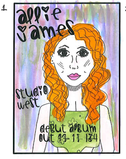
These are some ideas which I have come up with in order to make my poster look more interesting after the first draft. I have painted and added lots of colour onto the pictures which I have drawn as this makes it more bright and attractive to the target market. The paint looks a bit messy which also adds to the hand drawn look which I wanted to put across in my prodtucts.
I have done a water colour background in colours which are quite soft and girly in order to appeal to the intended target market. It looks quite messy and very hand made which is the look i wanted which is added to by the hand drawn style font. I have continued the pastel colours when painting her outfit as I think it fit in well with the colour scheme of the poster and works well. Her hair and outfit stands out against the background and makes this a very bright attractive poster.
I like the citrus type colour background on this as I think that it grabs attention and makes the intended audience look at it which is the point of the poster. Again, I have painted it using water colour which gives it the intended, messy hand made look which I wanted to put across. Also, the background colours work well and look good with the hair colour which is good as it looks like it has been designed as part of a final product as opposed to just done quickly. I have chosen an orange/pink colour for the outfit as it stands out against the background but also looks interesting next to the hair colour. I like the vibrant look of this poster and I think that it would interest my intended target audience.
I like the bright pink as the background colour as I think it really draws attention to the poster and would make my target audience look at it and have an interest in it. The fact that the pink is so bright means that its hard not to look at meaning it grabs attention and is very striking. The girly pink has been used as it reflects the female audience I have chosen as my target audience. I have coloured the dress in blue as this is the colour of the dress which my artist has and will be wearing in the video therefore it is fitting as part of the collective product. Overall, although the look of the poster is fairly messy, I think that this style works well becasue of the intended hand made look that I wanted.
I like the colorus which have been used on this poster as it is very warm as well as being bright in order to gain attention. I like the different shades of colours as well as think makes it look hand painted (which it was- however thats not the point, the point is it LOOKS this way) which is the intended look which I wanted. This hand made look is cointinued through the use of the font which also looks like it has been hand written. The only issue which I have with this poster is that the hair blends in slightly with the background and therefore my artist isnt as striking as she could be. I have chosen the stereotypically girly purple coloured dress as I feel this reflects the comg genre as well as my artist and intended audience.


No comments:
Post a Comment