Firstly, I create a new document on an A4 Photoshop- I make sure that this is landscape as it will then fit into music magazines which is where the advertisement is likely to be placed
The screen then looks like this
I need to add the backgrouns which is saved under images. I have made this background pre poster making and scanned it into the computer where it is saved. To get it onto the page I click on file > place
I then look through my files when the box appears until I find the picture. Once I have found it, I select it and press place
This then brings the image onto the page but it is all squashed and fat but doesn't fill the whole page
I then stretch the image so the flowers are in proportion and look like they have been made into the correct size and fills the page
Once I have done this, I click the grey tick in the corner which places the image on the page
The page then looks like this. The background is too bright/bold and so the other images and text which I want to add onto the page wouldn't stand out against it
To make this better and easier for the important features to stand out I need to change the opacity and make the image lighter
I do this by clicking on the layer in the grey box on the right side of the page and change it to 50%. This makes the page look like this which would be good to layer images and text onto
I want to insert an image so I click on file > place and find the image. Once I have found the image, I click on place and it appears on the page
Once it has appeared on the page, I can move it and stretch it so that the image is in proportion to the page. Once it is correct, I click on the tick and it placed is where I want on the page
The page then looks like this
I then need to get rid of all the white areas as this makes it look unprofessional and rubbish
To do this, after I have converted the image into a smart object, I use the magic want tool, select the white areas one by one and press delete. This makes the areas which were white disappear and you are able to see the background
The page now looks like this
Using the text tool, I draw a text box which is big enough to fit the text into. I write the artists name "Allie James" and highlight the text
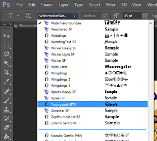
I can then change the font. I choose a funky quirky hand drawn style font as it would match the overall aesthetic which I want to achieve on my advert and digipack
I then change the font size to 90 as it would make it large enough to catch the readers attention
I then change the colour to dark blue violet as this stands out against the background, however doesn't look as harsh as black and therefore looks more suited to my artist
I then add the name of the album in size 40 font. This shows that it is fairly important however not as important and eye catching as the name of the artist
I then add the phrase "debut album" which follows conventions of other adverts as they use snippets of information to entice the audience into buying the product
I then add the date of release in a different font.This is because the other font wasn't bold enough to stand out so therefore I have found another font which is bolder yet still looks as though it has been hand written. I think that this makes for an interesting visual for my poster
In the old font I then add my artist's twitter name so that the intended target audience can follow her on twitter- as it is assumed they have twitter
Then, in order to add authenticity to the poster, I want to include the record labels logo. To do this, I click on file > place and find the image. I then click place
It then appears in the center of the page which I need to change the size and position of
I make it a lot smaller as to not make it a hugely prominent feature of the poster
I then move the re-sized logo into the bottom right corner so attention isn't immediately drawn to the logo
i then need to get rid of the white sections as this makes it look less professional. I do this by converting it into a smart object and then using the magic wand tool then deleting the white areas
It then looks like this
I then need to re-position everything to make sure it looks how I want it to in order to appeal and attract to the intended target audience as well as promoting the singer in a professional way
The end product looks like this


No comments:
Post a Comment