Showing posts with label design. Show all posts

Thursday, 14 November 2013

DIGIPACK IDEAS

I have come up with some ideas in order to make my album digipack look more interesting than my first draft. 

IDEA 1

I have used a light blue watercolour background as I think this reflects a vintage style which is something which my artist represents. The watercolour makes it look purposely hand made which I think makes it look more personal and enjoyable to look at. I have added patterns to the panels and I think that this has made it really exciting and fun to look at which reflects the upbeat style of the song which I have chosen as well as the genre. I have used orange polka dots in the pattern as they are bright and upbeat like the genre, yellow birds (they don't look like birds but it was a quick drawing) and red hearts as they look quite vintage yet girly/ Also the birds add relevance to the bird cages which I have used on two of the panels. The images of the artist have been coloured in watercolor paints which (again) look vintage styled and fitting with the genre. Overall I think this digipack idea is young and cool, however could be more girly in order to appeal to the tumblr kids more!


IDEA 2

I have used a watercolour background on this digipack. All of the panels are the same colour however the colours aren't all in the same place which I think makes it look more authentic and more as though it has been hand drawn. I have left the actual images uncoloured as I think that this makes it more unique and original and therefore would make it stand out against others in shops to make it more interesting to potential listeners. I like the colours used as they are quite girly and would be attractive to the potential target listeners and also reflects the style of my artist. Overall I really like this design as I think it looks original (perhaps memorable to people if they look at it?- always a good thing) and reflects the artist and genre well as well as being interesting to look at. The point of the album cover is to intrigue the potential listener and I think that this digipack is quite intriguing due to its originality. 


IDEA 3

I decided to try a more simple pattern by just using 2 colours which (in my opinion) work really well together as well as looking feminine to appeal to my target audience. The pattern which I have used is very simple and I think that using white polka dots against the green/blue background is understated but stands out. Also the pink of the feathered (bad drawing, its supposed to look like feathers but it was a "quick sketch") details on the side stand out against the green and reflect the style of my artist and the genre well. I like the colours which I have used to colour in the images used on the panels as they look quite cool and quirky and reflects my artist well. I also think adding some colour to the bird cages makes the digipack look more complete than they do when they are just left white. Overall I think this design is really fitting with the artist, genre and potential listeners. 


IDEA 4

I like the colours which i have used in this design as i think that it looks quite girly and so would appeal to my target market as well as reflecting the fun, upbeat nature of my artist and genre. I have added the light blue flower pattern to make it look less boring and more vintage looking as this is the style which I wanted to convey throughout my products (video-digipack-poster). I think that making the digipack look as though it is quite messy works well and looks genuine- so bad its good?- and so therefore is interesting and exciting to look at. I have (again) added colour to the bird cages which makes the pack look more complete as a whole which I think is good. The whole thing looks trendy and up to date with a vintage twist which is what I want my video to represent. The images of the girl which have been used on two panels have also been pained in water colour as this carries on with the theme and fits well with the "whole package" as well as reflecting the genre and style which I wanted to portray well. Overall I think that this is very aesthetically appealing digipack to my potential audience and therefore would be good to use for my final product.


Monday, 11 November 2013

POSTER IDEAS


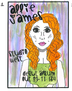
These are some ideas which I have come up with in order to make my poster look more interesting after the first draft. I have painted and added lots of colour onto the pictures which I have drawn as this makes it more bright and attractive to the target market. The paint looks a bit messy which also adds to the hand drawn look which I wanted to put across in my prodtucts.  


I have done a water colour background in colours which are quite soft and girly in order to appeal to the intended target market. It looks quite messy and very hand made which is the look i wanted which is added to by the hand drawn style font. I have continued the pastel colours when painting her outfit as I think it fit in well with the colour scheme of the poster and works well. Her hair and outfit stands out against the background and makes this a very bright attractive poster.


I like the citrus type colour background on this as I think that it grabs attention and makes the intended audience look at it which is the point of the poster. Again, I have painted it using water colour which gives it the intended, messy hand made look which I wanted to put across. Also, the background colours work well and look good with the hair colour which is good as it looks like it has been designed as part of a final product as opposed to just done quickly. I have chosen an orange/pink colour for the outfit as it stands out against the background but also looks interesting next to the hair colour. I like the vibrant look of this poster and I think that it would interest my intended target audience.


I like the bright pink as the background colour as I think it really draws attention to the poster and would make my target audience look at it and have an interest in it. The fact that the pink is so bright means that its hard not to look at meaning it grabs attention and is very striking. The girly pink has been used as it reflects the female audience I have chosen as my target audience. I have coloured the dress in blue as this is the colour of the dress which my artist has and will be wearing in the video therefore it is fitting as part of the collective product. Overall, although the look of the poster is fairly messy, I think that this style works well becasue of the intended hand made look that I wanted.


I like the colorus which have been used on this poster as it is very warm as well as being bright in order to gain attention. I like the different shades of colours as well as think makes it look hand painted (which it was- however thats not the point, the point is it LOOKS this way) which is the intended look which I wanted. This hand made look is cointinued through the use of the font which also looks like it has been hand written. The only issue which I have with this poster is that the hair blends in slightly with the background and therefore my artist isnt as striking as she could be. I have chosen the stereotypically girly purple coloured dress as I feel this reflects the comg genre as well as my artist and intended audience.

Sunday, 3 November 2013

DRAWN POSTER IDEAS

These are some band posters which have been hand drawn. I think that these look really cool and interesting and would therefore be striking to look at. The aim of the poster is to grab the attention of my intended audience and I think that the fact these are hand drawn makes them stand out. The hand drawn style would be appealing to my intended audience, specifically the creatives as they have an interest in art, and so would therefore be a good style to use when designing my poster and digipack.


EXAMPLES

The image shows some examples of hand made posters which are shown in my media classroom

RUSSIAN CIRCLES
I like the colour scheme as it is quite dark and spooky which has been done to reflect the rock/metal genre of music. This would therefore appeal to this audience and links in well with the creepy, hand drawn image. The colour scheme which I use within my poster and digipack won't incorporate the same dark colours, however the colours need to appeal to the intended audience.
DEVO
I really like the simple image which has been used in a bright colouras it draws attention to the picture which then has the name of the band on it. Although the hand drawn design doesn't really reflect the new wave genre, it grabs attention. I want my poster to have relevance to the genre and my artist in order for all of the products to interlink.
ARCADE FIRE
I like the urban look of this poster. Although it isn't hand drawn, all of the images have been added together to make it look like a collage which has been purposely done to look hand made. The bright colours will attract a young audience which I need to include as my intended audience will be fairly young, such as the tumblr kids.
PIXIES
I think that this poster is a bit strange however it grabs attention because it is something weird to look at. The images used look (intentionally) hand drawn and I think that this works well and the text font used also looks as though it has been hand written. Although it doesn't look stereotypically 'professional' (the colouring in looks messy intentionally), it is eyecatching and grabs atention and looks really good. I want my poster to look intentionally hand drawn like this one does.

I wanted to do my poster in a hand drawn style because:
  • I think that it would fit in well with the vintage style which I wanted to go with. This would therefore make the 3 products which I am making (poster, digipack, video) look as though it is all part of the same product- which it is- and so would look more complete
  • It would grab the attention of my intended audience as it will stand out from other posters. They are interested in art and design so seeing the poster with elements from this will be attractive to them.
  • I think it works well and using photographs would limit me to the vintage, rough look that I want to convey. I have seen examples of previous students work where they have hand drawn the poster and digipack and it looks really good and fitting with their video. Using photographs wouldn't have had the same appeal and I feel this is the same for my project.


Monday, 14 October 2013

INSPIRATION: SALLY COTTERILL


I have found an illustrator (Sally Cotterill) who designs many things in a hand drawn yet professional style. I am considering doing a hand drawn design within my poster and digipack. By looking at her work, it is clear to me that the images are more striking than a photo would be as they are a little bit different and interesting. As I would consider myself to be within the target market group, I would be attracted to these designs and this style of drawing and if I saw it on a poster or album cover then I would be intrigued by it. This shows that a hand drawn sketch would be good to use as it would have an impact on the intended audience. 
One of the things which I like the most about these images by this illustrator is that they look hand drawn however they are very professional. The hand made element is clear and is something which I would like to show within my poster and digipack. The colours which she uses are very girly which, again, is something I would need to copy as my intended target audience are female and would therefoe be attracted by feminine colours- such as the ones used in these images. The colours and style of drawing also show a vintage edge to the sketch which, again, is a look which I am aiming to achieve in my poster, digipack and (to some extent) my video.