I have looked through a variety of digipacks in class including the Franz Ferdinand CD pack, The Beta Band CD pack and Kid Koala's digipack. These have shown me how my final digipack product will be made and how it would look to a potential buyer.
I want my product to have the same sort of vinatge feel to my video so that it all links together as well as refelecting the genre of music which I have chosen.
I have also looked at some books which include CD covers in order to give me ideas which I could use when making my digipack.Some of the covers are quite simple which I think would look good. Some of the images in the books were very colourful which I think my digipack needs to be. This is because the genre,song and artist are young and the song is quite playful so the digipack needs to be colourful in order to grab attention.


I have also looked at some books which include CD covers in order to give me ideas which I could use when making my digipack.Some of the covers are quite simple which I think would look good. Some of the images in the books were very colourful which I think my digipack needs to be. This is because the genre,song and artist are young and the song is quite playful so the digipack needs to be colourful in order to grab attention.

I like the randomness and bright colours of this image and it is something which I should look at when designing my digipack.

The vintage style images are something to look into as this would fit in with the vintage theme of my video- however this isnt completely necessary (but it must reflect the genre).

These covers in the "1000 RECORD COVERS" book are very colourfuland bright which is something that would appeal to my target audience and so proves I should make my cover really colouful and fun.

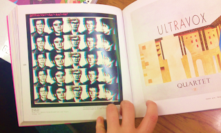
I likle the blurry image and I think that this looks interesting and unique which is important. I also like the idea of using the repeated image as it is very attention grabbing.

The images in this book were all very cool and retro but had incorporated the right colours which I should use.

I like the randomness of these album covers and I think that they arereally colourful which is really interesing to look at. My favourite is the vintage cassett tapes image because I think it is really intresting to look at and an image like this would reftlect the video, genre and artist identity which I need to.

I like the simplicity of this image. I think I should keep my digipack simple

Again, I like the simple image and positioning of the text. The central text draws the eye to the writing which is important.

I like the bright colours of the image and having the child on it makes it a more intriging cover to the person looking at it. None of the text font goes together well but I think that this makes it more interesting to look at. I like the randomness of this cover.

The album covers in this book range from dark simple ones to bright random ones. I like the simple ones however if I was going to do a simple cover then it would need to be bright and colourful in order to represent the nature of the song and the identity of the artist who I've created.
ACTUAL ALBUMS
In class there were some digipacks which were quite unique which I looked at.

I like the randomness and colours used on this digipack and this is something which I could incorporate in my digipack. It is fun to look at and would appeal and attract my target audience which is the main aim of an album cover and the digipack.


I like this one as it looks as though it has been drawn by hand which is really cool and different, however the brown colour is quite boring. I think having the lyrics look like they have been written into the book is cool so the hand written font could be something to use in my digipack.

I like this digipack because the artists name is very eye catching on the black background and would grab attention. Its also very simple which is something to consider when designing my digipack.
No comments:
Post a Comment